One of the lessons that we have gone over in class is color. It is one of the most easiest design elements to recognize.
This is a pop art picture that I made of my Chihuahua. When I added the color I tried my best to use a flattering complementary color scheme. A long with using complementary hues I also tried to use similar chromas in each square.
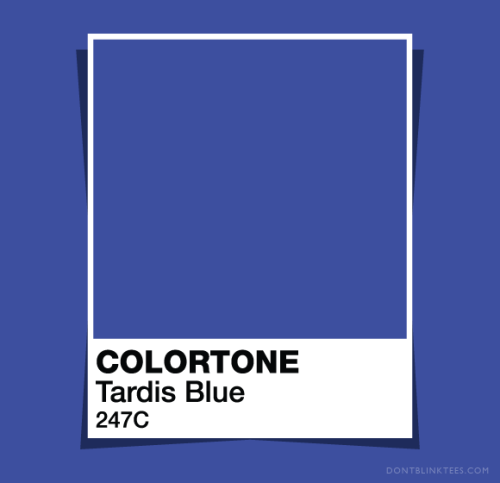
After looking through many different shades of blue I found that this one here seems to stick with me the most. (Oh, I also am unsure if that is the colors real name or not.)
Design in Everyday Living
Thursday, January 19, 2012
Tuesday, January 10, 2012
In The Beginning.
This blog is for my interior design class, I have no experience with blogging so this may be slow going at first. My hope is to post at least once a week with things that relate to my class and that I find interesting.
The first picture that I found is of an Italian kitchen. What First caught my eye was how well balanced the room was. I also like how it has a cottage charm to it.
Next up I came across a 18th century Italian luxury living room with a very Victorian style to it. My favorite thing in this room is the full length mirror.
The last picture that I found is from a London home. This now bathroom was once a small sitting room for entertaining guests. I like the simplistic placement of the furniture in this room, and how few pieces there are.
Subscribe to:
Posts (Atom)