
This is a pop art picture that I made of my Chihuahua. When I added the color I tried my best to use a flattering complementary color scheme. A long with using complementary hues I also tried to use similar chromas in each square.
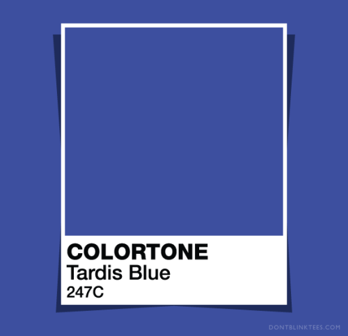
After looking through many different shades of blue I found that this one here seems to stick with me the most. (Oh, I also am unsure if that is the colors real name or not.)
No comments:
Post a Comment